Located in the heart of Silicon Valley, Menlo College was founded in 1927 and is a small, private undergraduate college with a scholar/athlete focus. Motivated by a new 2020 Strategic Plan to raise the school’s academic profile, increase enrollment, enhance the student experience, and reposition their focus on the art of business in the entrepreneurial economy, they wanted a new, modern, vital brand identity to support their new positioning.
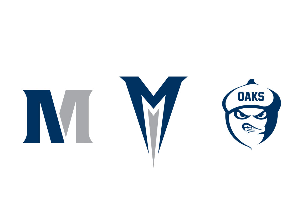
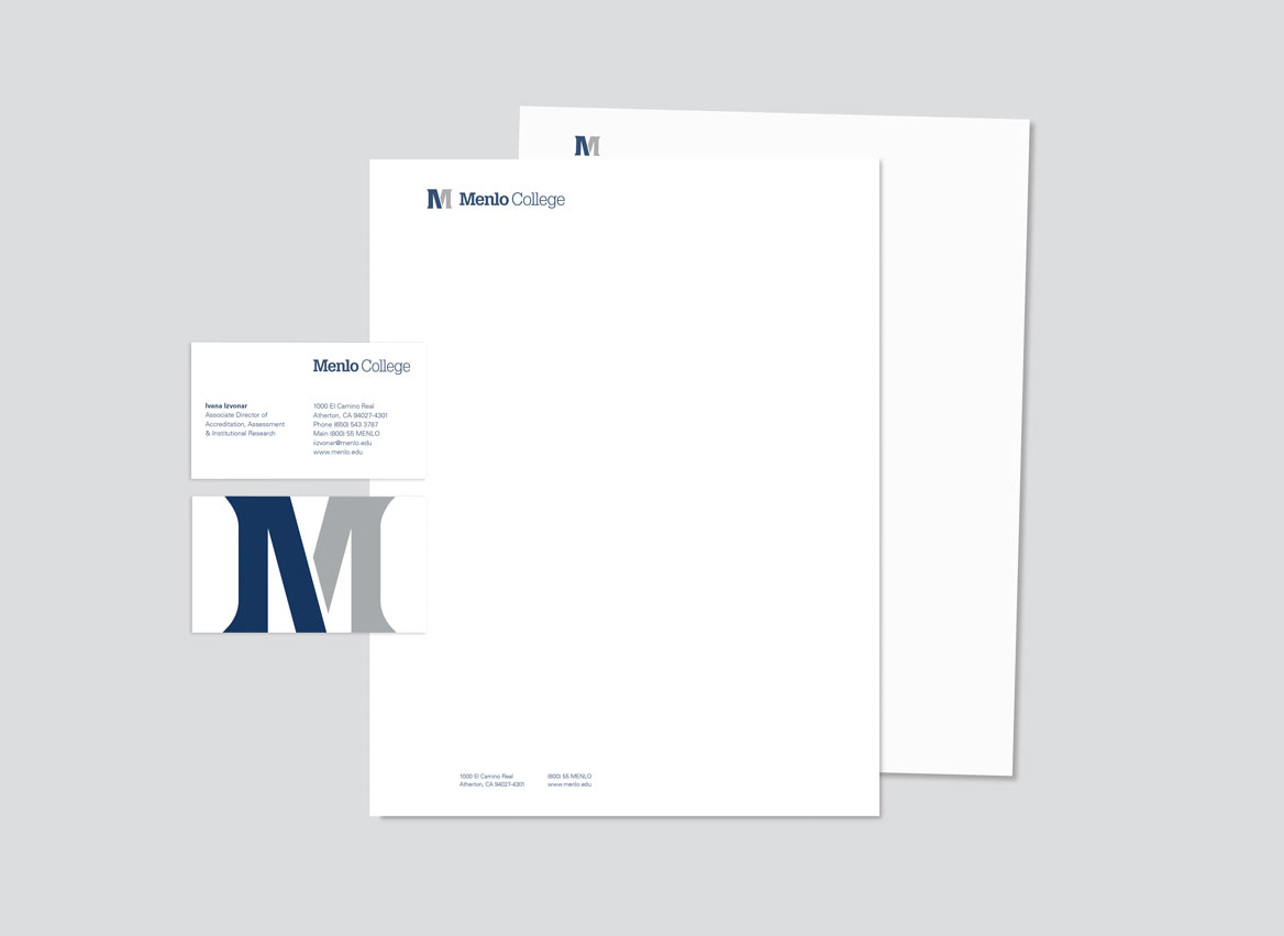
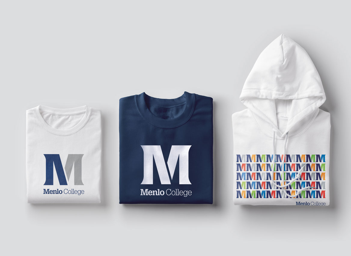
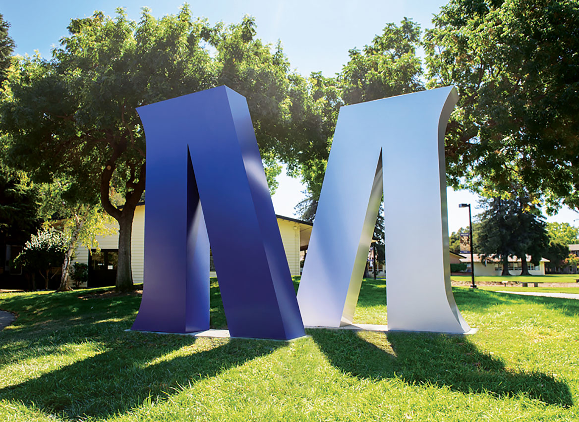
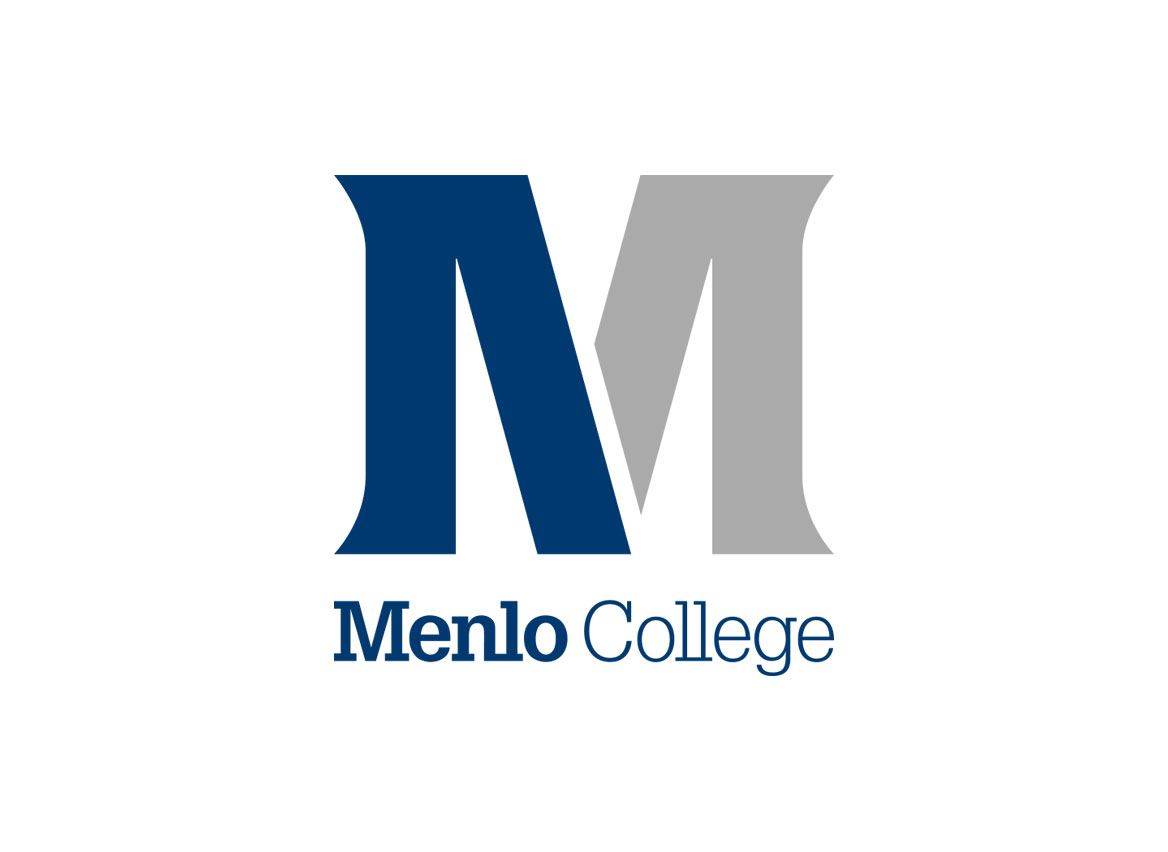
Known as the “Mighty Oaks” for their significant number of large, beautiful, heritage oaks on campus, our logo took all the attributes of an oak tree—strength, endurance, success, stability, protection, growth—and infused them into a monogram symbol. The M symbol shows a coming together of parts—the scholar with the athlete, the art with the science of business—to create a whole. The primary wordmark is boldly Menlo, and it’s nestled letterforms make the mark feel like the strong, tight-knit community Menlo College is.
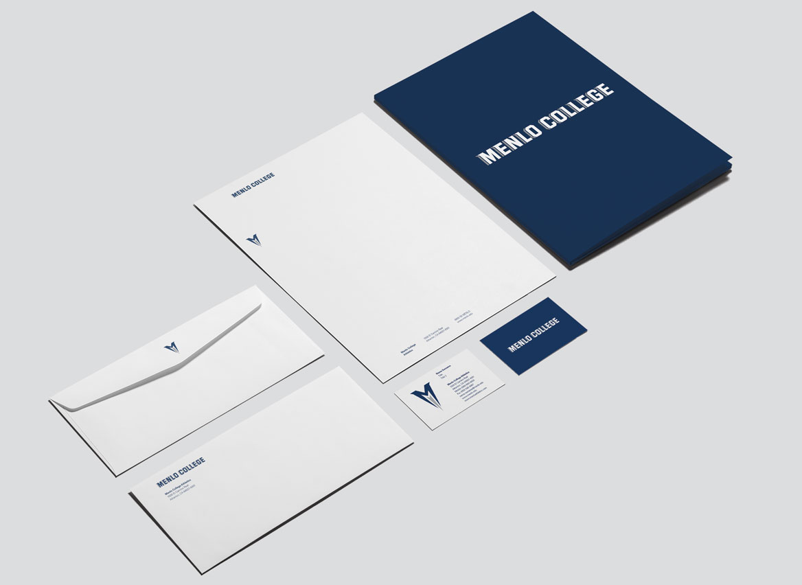
Both having M symbols, the college symbol is rooted in its mass while the athletics symbol is bursting upward with energy and drive. Oakie the mascot was updated as well to be more streamlined and have more attitude.