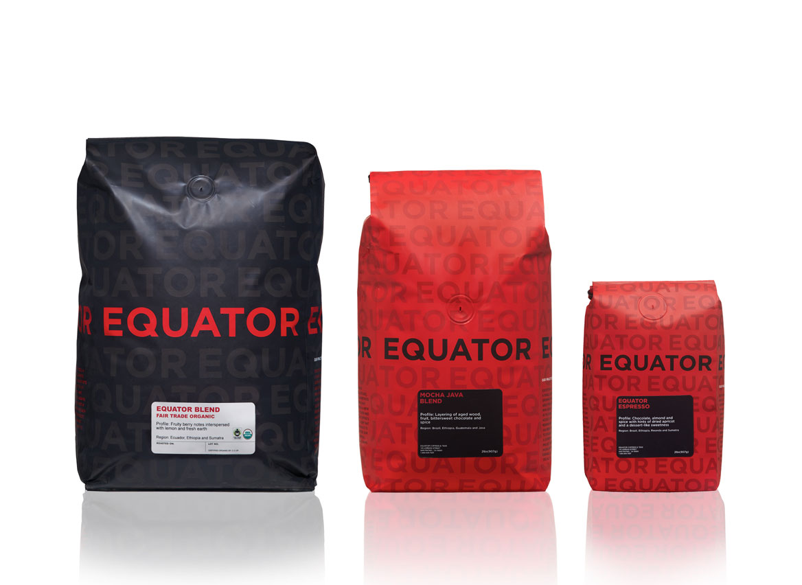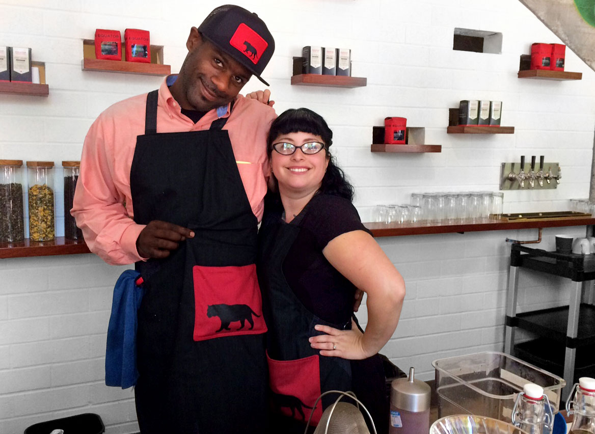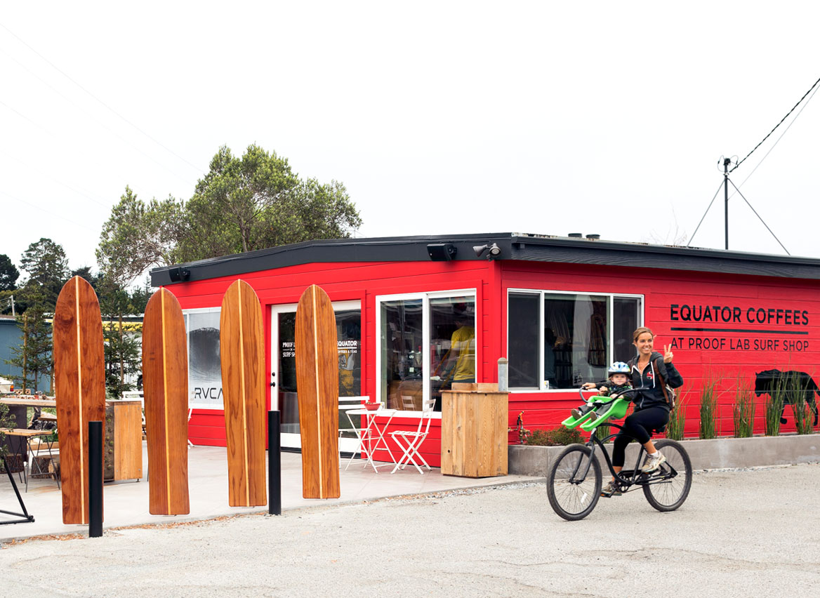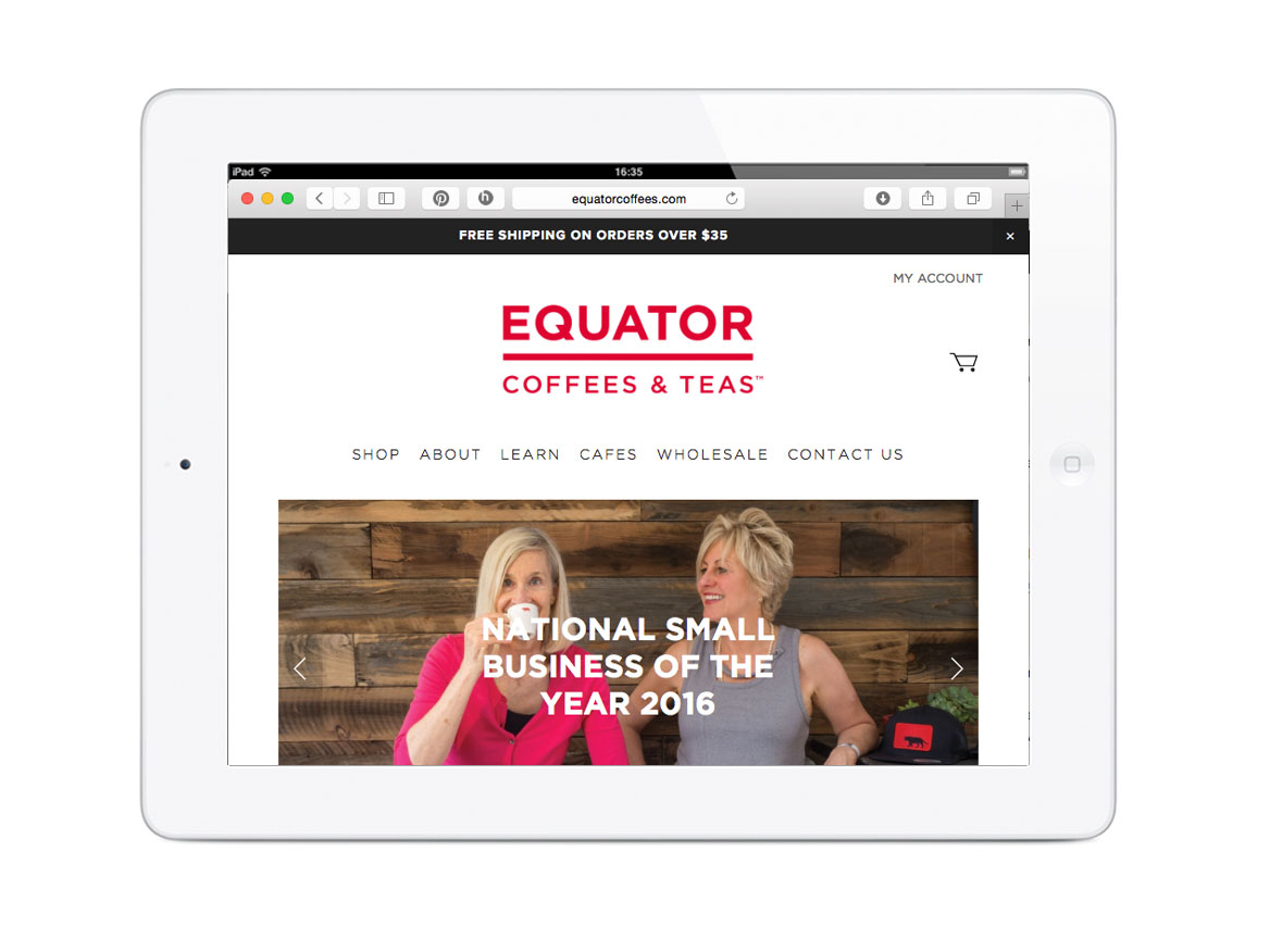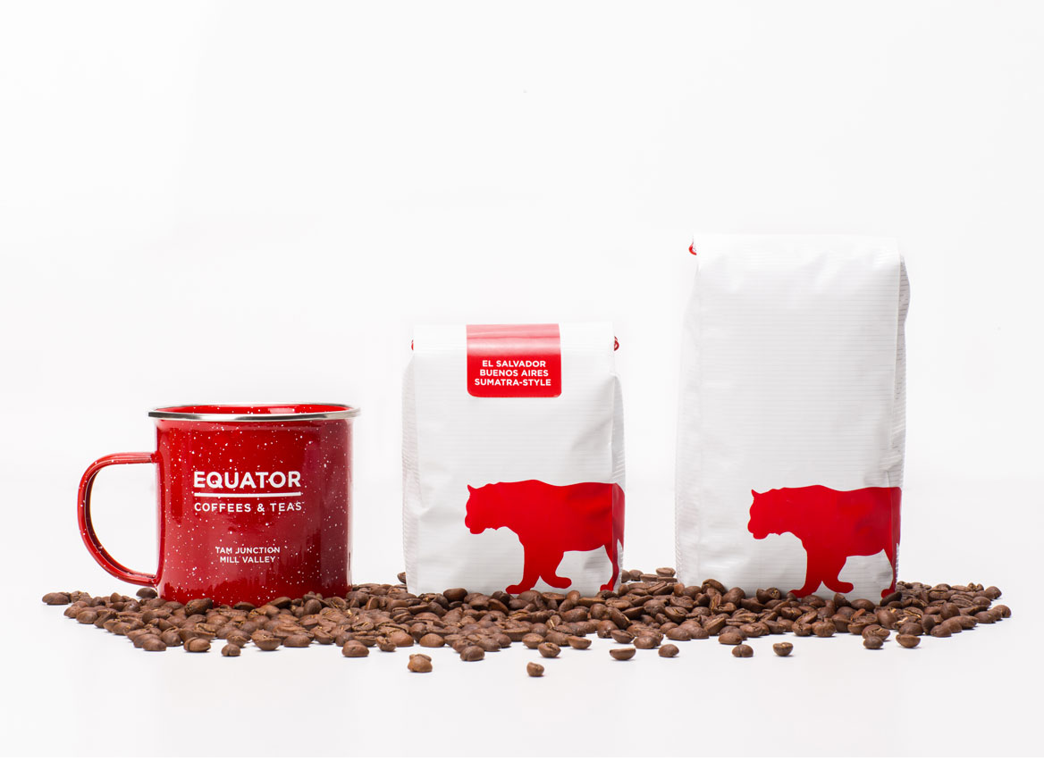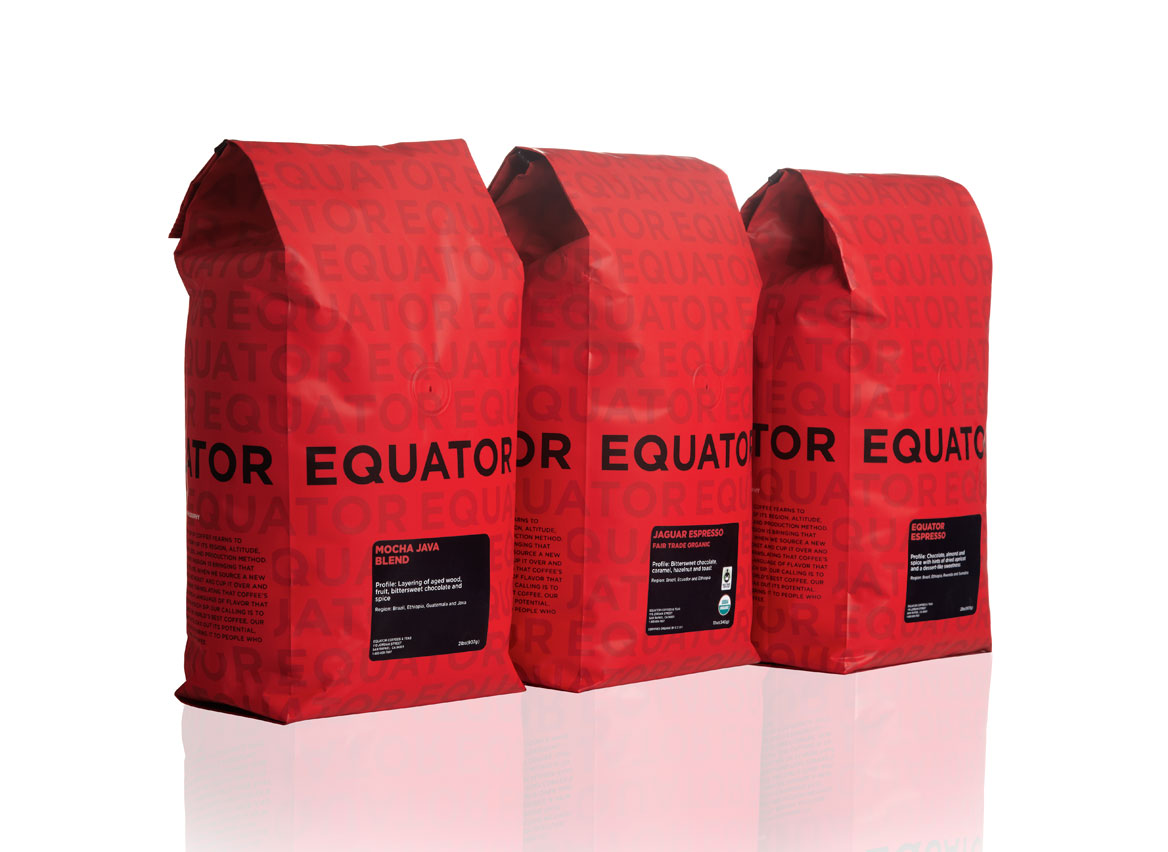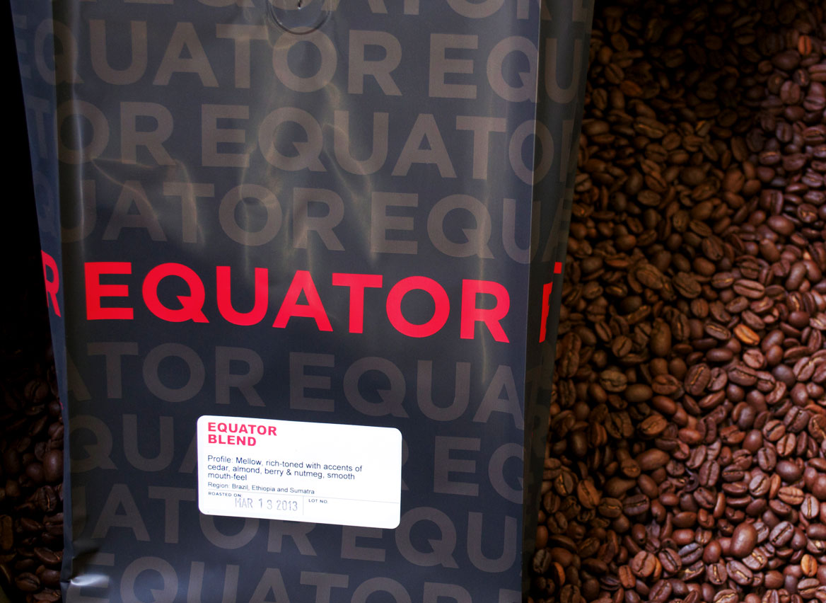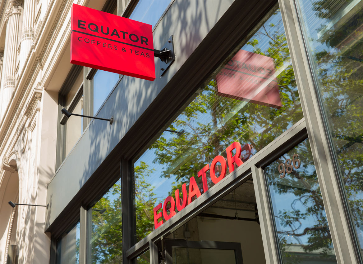
Headquartered in Marin County, California, Equator is a coffee roaster, tea purveyor, retail operator, and coffee farm co-owner offering distinctive micro-lot coffees and rare teas to fine restaurants, hotels, and retailers. Our design partnership began in 2011 with a rebranding and packaging redesign, and we've been with them ever since—as they opened five retail locations in the San Francisco Bay Area, became the first coffee roaster in the U.S. to become a certified B Corp, and received the National Small Business of the Year Award in 2016.
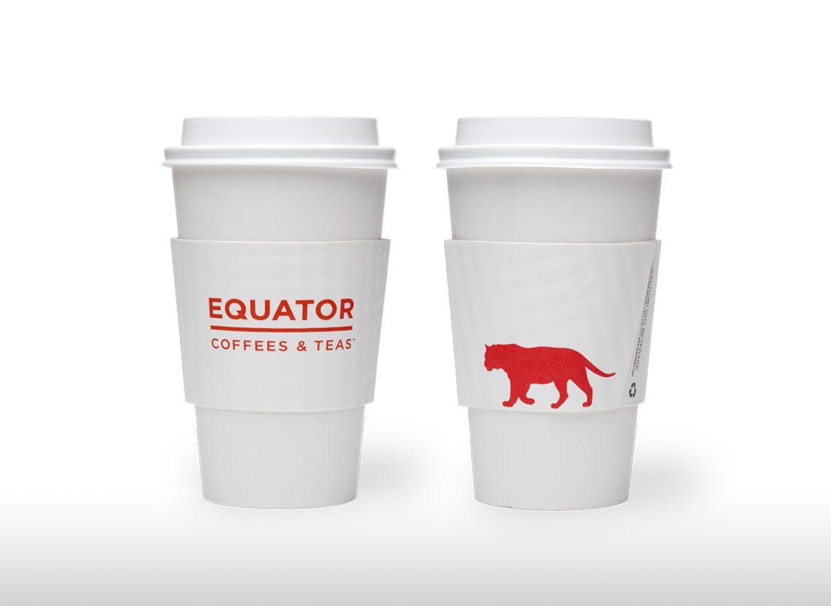
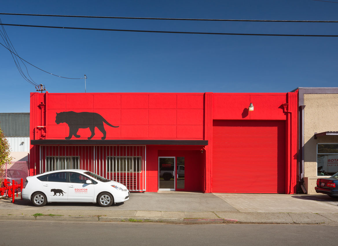
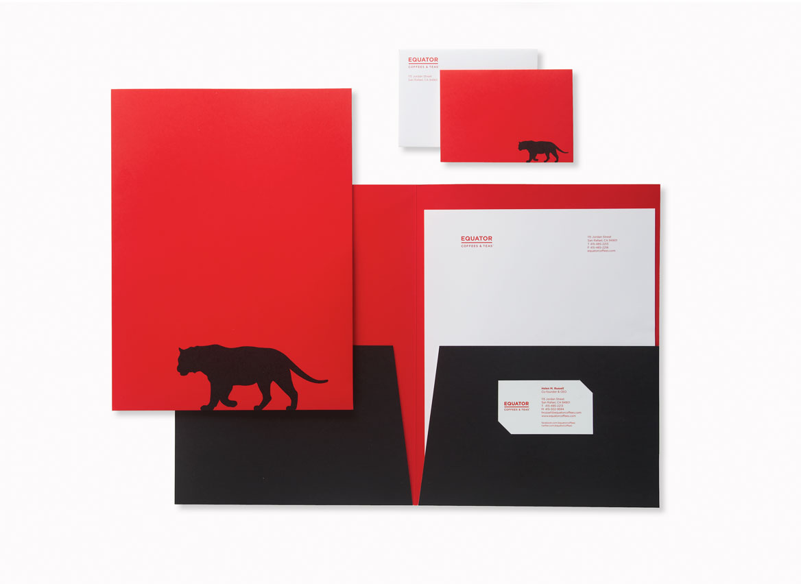
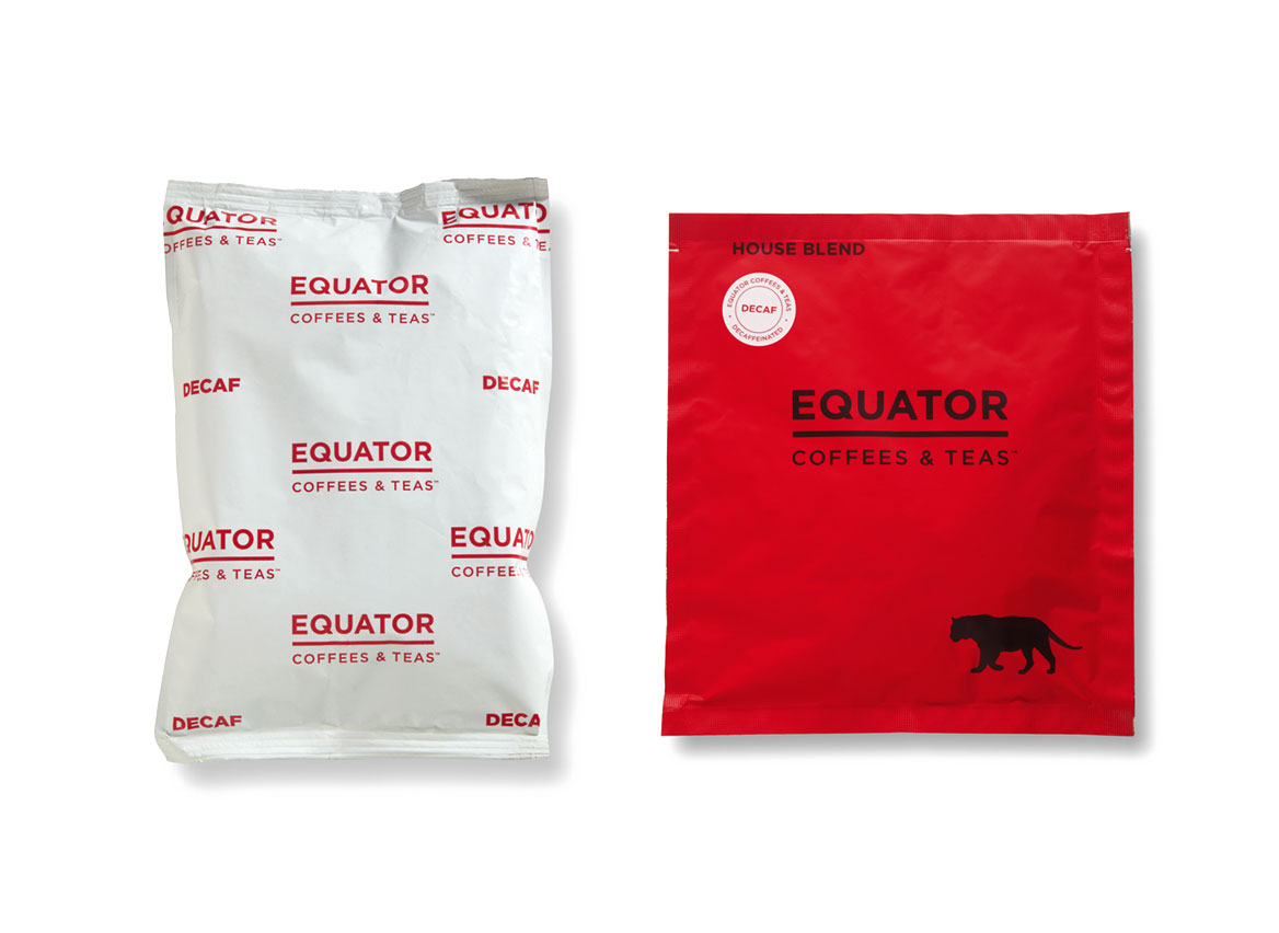
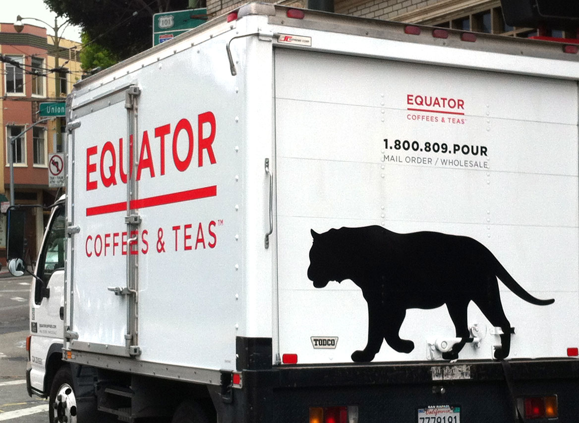
From identity design to packaging to collateral and environmental graphics, the Equator branding system tells its unique story—obsessive attention to green coffee sourcing, uncompromising roasting expertise, and a 20+ year commitment to sustainability that creates a remarkable experience in every cup. There are three prominent design elements in the branding language: the equator line which reinforces the company name with a visual; the color red which symbolizes the heat of the earth’s equatorial region (all coffee is grown between the Tropic of Cancer and the Tropic of Capricorn—the center point of which is the equator, the “middle of the world”); and the Bengal tiger which roams the equatorial region and, like the coffee plant, prefers the tropical climate.
